



Most knowledge workers who want to make presentations don’t think of
themselves as designers. It’s fair to say the visual design of
presentations is daunting enough to consume most presenters’ mental
space. Perhaps that’s why we equate the slides with the presentation.
Visual design is a broad subject, so we can’t cover it in its
entirety. However, it’s important enough that the next few articles in
this series will focus on slide design. I’ll begin with some
fundamentals. Imagine I had to create a presentation about the content
of this article. If I had to create a title slide for that deck, I
might make it look like the one below. It juxtaposes a few elements —
an image, text and some colours — into a layout.
Figure 1: A simple title slide
combines an image, some text and light-handed colours.
If I were to continue building these slides, I’d have to make some
recurring design decisions. Instead, I embed these decisions into a
template. We’ll discuss what it takes to set up your own template, but
first let’s address an elephant in the room.
The corporate template
If you work at a large enough corporation, your employer may have
provided a corporate slide template. There are good reasons for this.
Most people aren’t adept at assembling slides, so it helps to codify
some default layouts in a template. People often use colours and fonts
that may clash with the brand’s aesthetic, and a template can place
some guardrails to avoid these errors.
The trouble with standard templates is that everyone uses the
defaults. Before you know it, everyone’s slides look the same. People
ignore boring things, so there’s value in breaking that monotony.
Now, if you can understand what your marketing colleagues are
trying to achieve with their prescribed templates, you can adhere to
your corporate brand and assemble slides that look unique.
Through the rest of this article, I’ll show you how to build your own
template, but you can also use that advice to unpack the key elements
of any corporate slide template.
Start with a colour palette
As a self-taught designer, I’ve often struggled with making
colours play well with each other. For some people, colour choice is
intuitive. When you reuse the same colours in all slides of your
presentation, the visuals gain a cohesive identity.
It’s helpful to understand the basics of colour theory, so you know
which colour palette might work for your presentation style. The
colour wheel is a good starting point. Think of it as an abstract
illustration of the colour spectrum that helps you understand which
colours work well together.
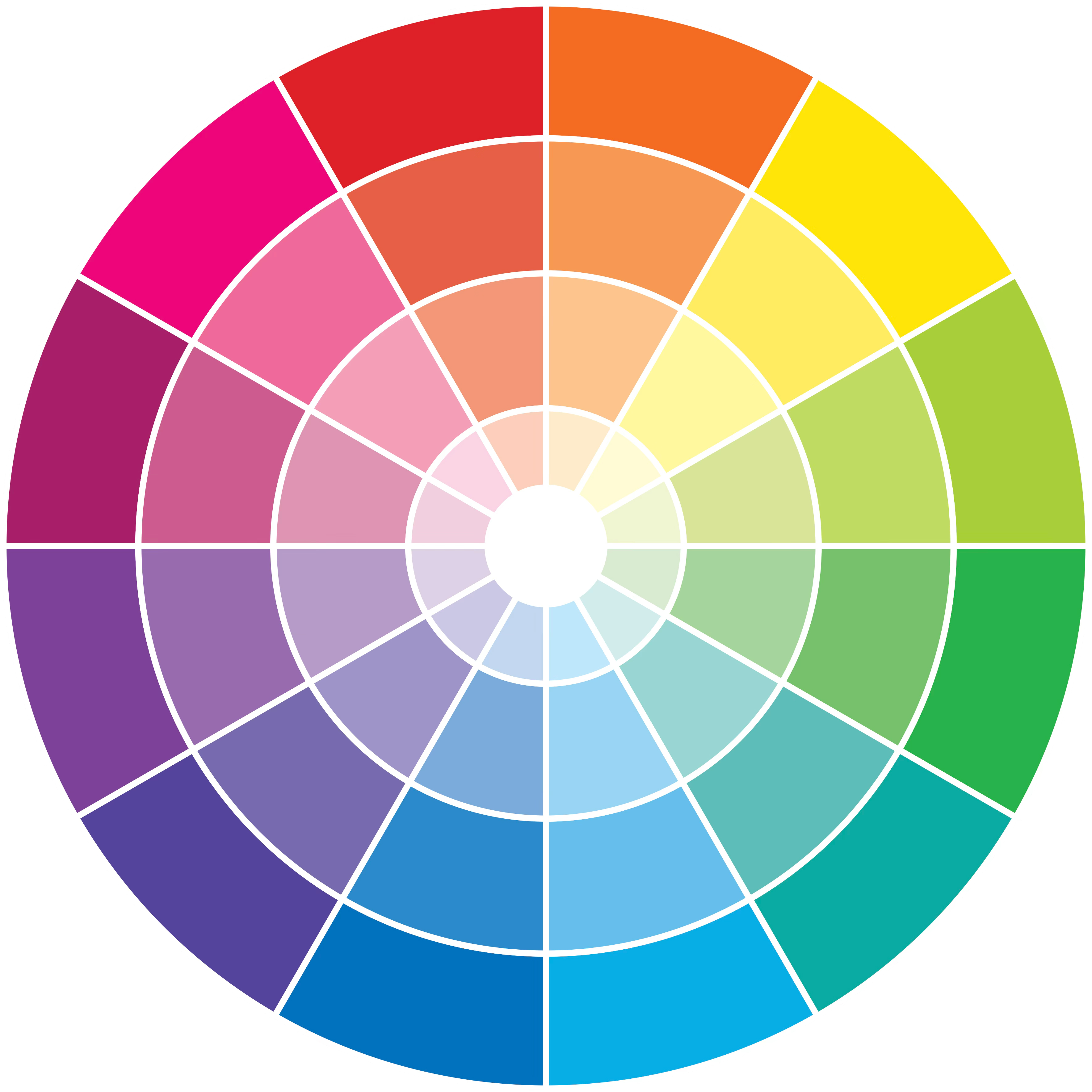
Figure 2: A basic colour wheel.
When you examine the wheel, you’ll notice that the closer the
colours are to the centre, the less intense they are. Colours at the
periphery are more saturated. There lies lesson one. If your
slide background will be white or light, choose colours that sit at
the periphery. If you want your slide background dark, choose colours
that sit close to the centre.
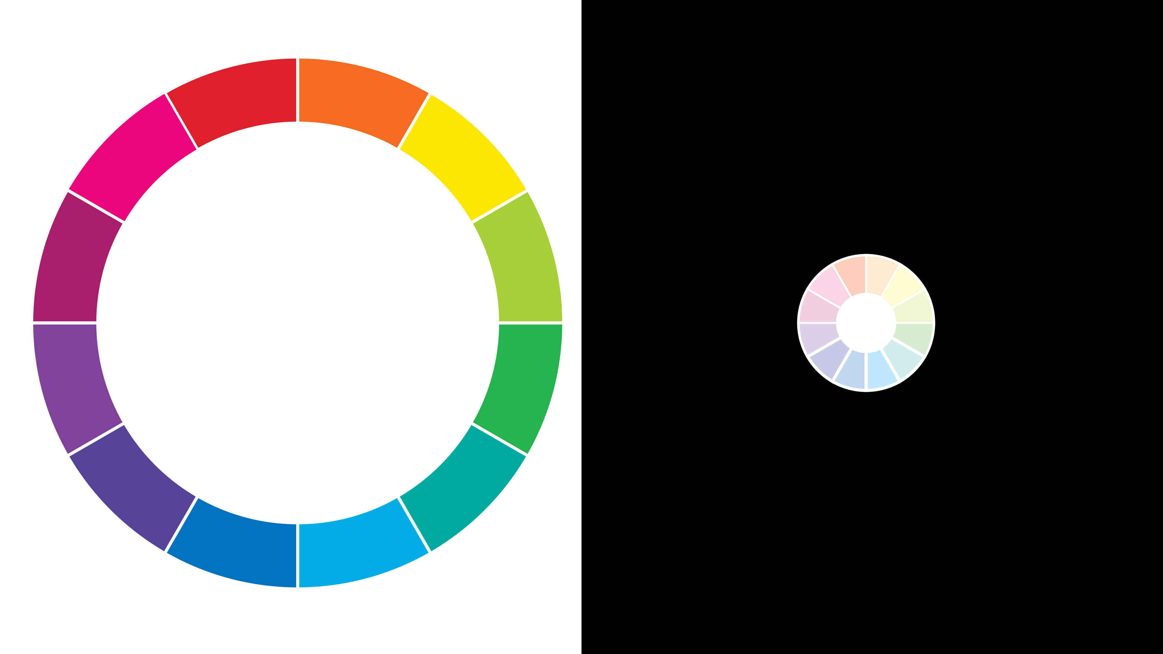
Figure 3: Colours at the periphery
work well with light slides. Those towards the centre work well with
darker backgrounds.
There are many ways to choose colours and build your palette.
Adobe provides you with a free,
interactive colour palette generator to play around with the
colour wheel and land on a theme you like. You can build your palette
from scratch, browse trending palettes, and even generate them from a
photograph that represents the content you want to present.

Figure 4: Generating a colour palette from a
representative image.
The advantage of working with palettes is that software like
PowerPoint lets you swap themes across your entire presentation
without updating every diagram. Choose a new theme, and PowerPoint
recolours all your diagrams and slides. The interactive demo below
shows you how you can swap your colour palettes in PowerPoint.
But here’s a word of caution. Resist the temptation to invent a
new colour palette for every presentation. As a corporate presenter,
I’ve found it helpful to find or create a palette that I like and
then stick with it for months, often years.
If you work for a large corporation, someone else has likely
already defined a colour palette. For example, at Thoughtworks, our
corporate palette has six colours, plus black and a light grey shade.
Since most of these colours are dark, I use them on a light
background.
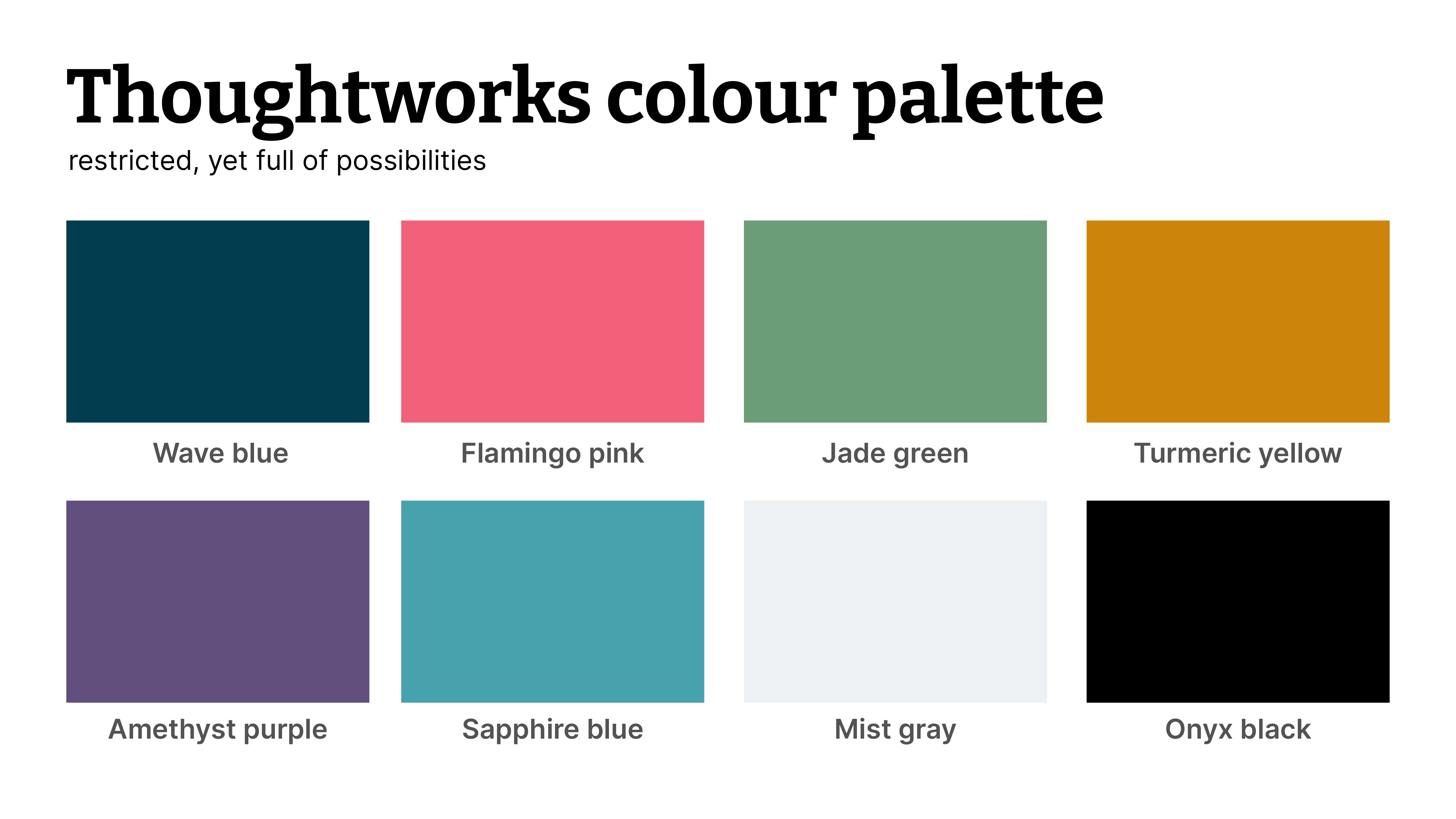
Figure 5: The Thoughtworks colour palette.
Over the years, I’ve built a diagram library that reuses the same
colour palette, so if a presentation references one of my core
ideas, I incorporate a representative diagram into a Thoughtworks
slide deck. It’s the compounding benefit of using the same, boring
colour palette.
Novice designers often use too many colours in the quest to build
colourful slides. Now that you know a bit about colour theory, you’ll
realise that if you pick too many colours from the wheel, you’ll
struggle to establish a theme and a visual identity that’s evident
across your slides. So, choose a restricted colour palette instead.
Limit yourself to six colours, then add black and white to the
palette. Less is more. As a bonus, consider all shades of grey as
free additions.
Next, pick the fonts you’ll use
As presenters, we needn’t be experts in the dark art of
typography. Most presentations need only two or three fonts.
Sometimes, one font face is plenty. Consistency beats variety.
But here are the basics. There are two types of fonts, each with
its own merits — serif and sans-serif. Serif fonts have little feet,
i.e. the serifs. Sans-serif fonts literally lack serifs. The image
below shows the difference.
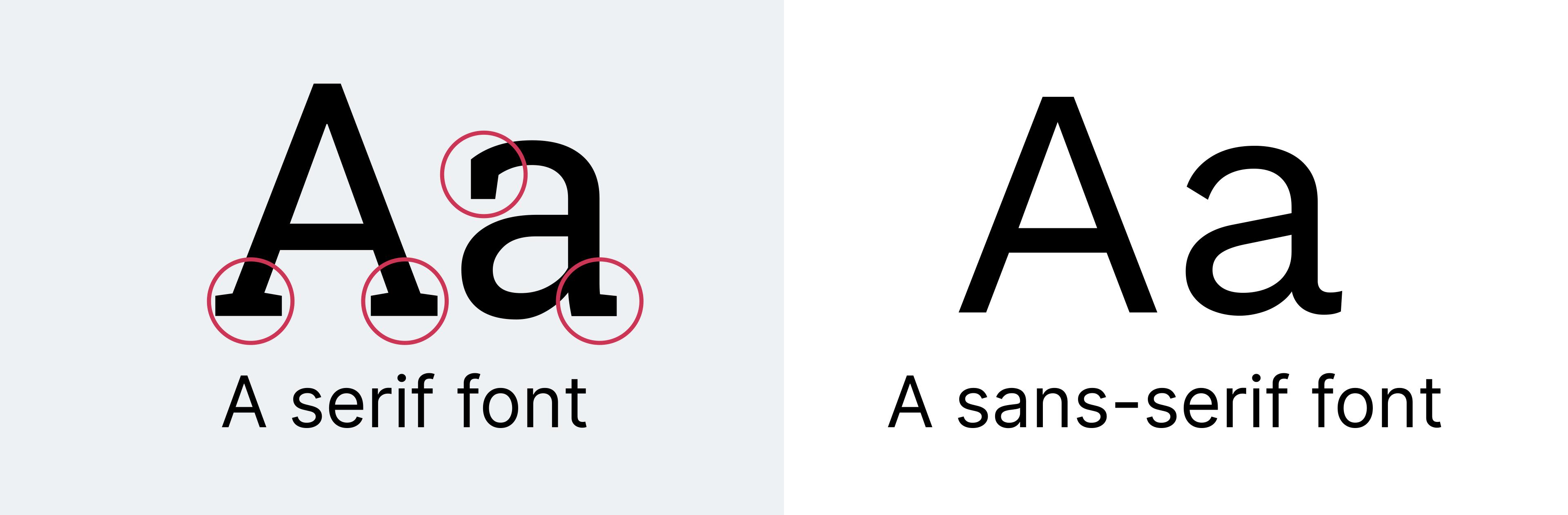
Figure 7: Serif fonts have little feet and
extensions. Sans-serif fonts don’t have them.
If you’re reading this article on martinfowler.com,
you’ll notice the website’s serif typeface. And that’s a great use of
serif fonts. They’re more suited to reading and paragraph text. This
is also why newspapers still use serif fonts.
Sans-serif fonts, on the other hand, suit billboards and signage
better. When you drive around your town, look at the fonts on large
advertisements. It’s likely they employ sans-serif fonts. Presentation
slides are more like billboards than magazine pages.
So, if you had to default to one kind of typeface for your
presentations, I’d recommend picking a sans-serif font. They work
well for online presentations, where the resolution is often a
maximum of 1080p or 720p, and just as well for keynotes in large
auditoriums with state-of-the-art projectors.
However, there’s no harm in mixing and matching fonts. You could
use a serif font for titles and a sans-serif font for the rest of the text. The
key is to stay consistent and avoid what Neal Ford calls the
“fontaholic” antipattern.
A Fontaholic is someone who believes using a cacophony of fonts
will “jazz up” a presentation. Disharmonic fonts are jarring. They
make presentations gruesome and more difficult to read.
Here’s an example of a slide that uses a serif font for the title
and a sans-serif font for everything else.

Figure 8: Mixing and matching serif and
sans-serif fonts.
Limiting the number of fonts in your presentation shouldn’t limit
your creativity. Modern, variable-weight fonts allow you many
variations for the same typeface.
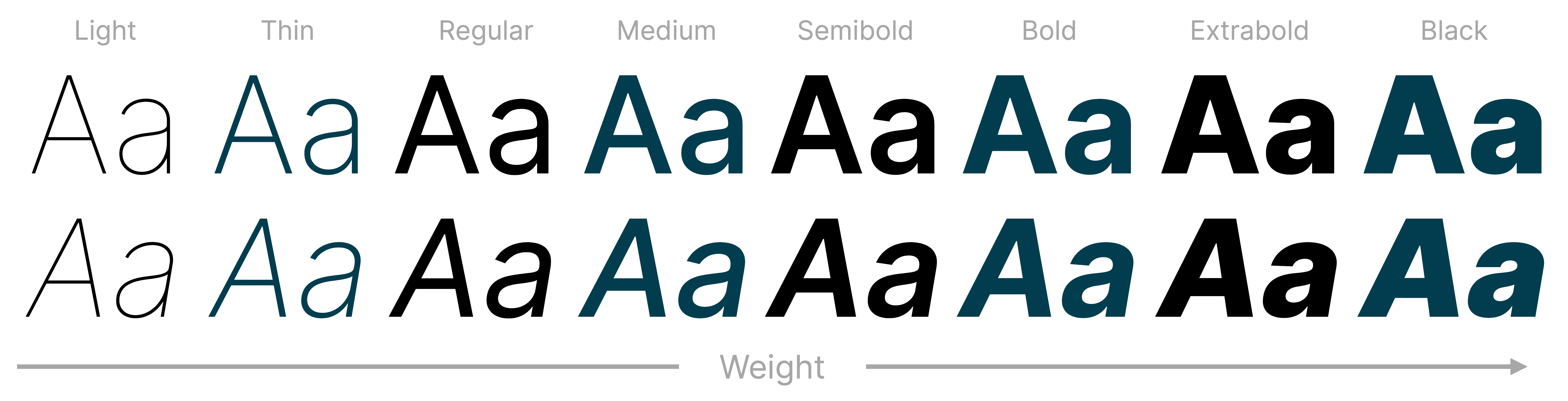
Figure 9: Variable-weight fonts offer
you a lot of versatility.
Aside from serif and sans-serif fonts, I’ll advocate for two more
font types.
Handwritten fonts
I suggest using these fonts only for annotations. They’re
excellent at breaking the pattern and monotony of your standard
fonts, and that’s handy when you want to draw your audience’s
attention to a specific part of your presentation. For example, in
the slide below, the red, handwritten font appears after each part
of the diagram builds, drawing the audience’s attention to the
compounding benefits of the AI flywheel.

Figure 10: You can use a handwritten font for
annotations and break the visual monotony.
Monospace fonts
If you’re a developer and you often show code snippets in
presentations, I suggest adding a monospace font to your
repertoire. In code, spacing is part of the meaning. A monospace
font gives every character equal width and helps you maintain
indentation, columns, and structure. Your code is easier to scan
and far easier to explain on a slide. Here’s an example from
Phillip
Schmid’s presentation at the AI Engineer conference, where he
explains how to invoke Antigravity as a remote agent.

Figure 11: Using monospace
fonts to show code (credit: Phillip Schmid).
Even non-technical presenters can use monospace fonts to
explain some concepts. For example, when explaining Slack channel
naming conventions, I use the following slide.

Figure 12: Even non-technical
presenters can leverage monospace fonts.
For those of you who are curious, here are some of my favourite
fonts.
Font choice aside, pay attention to how you use fonts. Sometimes fonts
don’t work well out of the box. To make them look right, you may
have to adjust kerning (a.k.a. character spacing) and leading (a.k.a.
line spacing).
In the example below, notice the extra gaps between the letters A
and V, V and A and T and A. Now drag the slider to see how I’ve
adjusted the kerning between the letters, so the characters have an
even distance between them.
When you’re showing quotes in a presentation, you’ll often run
into issues with leading. In the example below, you’ll notice that
the gap between each line is too wide. When you drag the slider,
you’ll see how a leading adjustment brings the lines together and
makes the quote look cohesive.
If you understand these fundamentals of font choice and
typographic spacing, you have enough typography knowledge to build a
slide template. All that remains is your slide layouts.
No layout is the best layout
I’ve struggled to adopt slide layouts and failed. In the last
decade or so, I’ve found myself rejecting cookie-cutter layouts and
starting with a blank slide each time. I follow some slide
construction principles, which I’ll show you in a future article,
but my template itself is quite simple. When you see my slides,
you’ll notice why it’s difficult for me to follow the standard
layouts that come with slide templates.

Figure 13: I find it difficult
to adapt my design approach to standard slide layouts.
So, I’ve deleted all prescribed layouts that come with our
corporate template. My template has three layouts, and I use the
blank slide almost all the time. I’ve set up the Thoughtworks
corporate palette on my system, so I can choose the colours when I
need them for diagrams. I’ve also set up a few font styles based on
a serif-and-sans-serif font combination. I use handwritten fonts and
monospace fonts on a case-by-case basis, so you won’t see font
styles for them. The interaction below will show you different
components of my standard presentation theme.
You’ll notice that my template is uncomplicated, and that
simplicity lends me a lot of flexibility and power when constructing
slides. My slides don’t have page numbers, copyright notices, or even
company logos, except on the title slides. Slides are not documents,
so slide numbers are irrelevant to my presentations. I don’t want to
sue anyone for copying my slides, so I usually leave out the copyright
notice. And I want to introduce myself and my employer once at the start and
leave it there. From that point on, the logo is an avoidable visual
distraction. Taking away these floodmarks
(credit: Neal Ford) affords me the luxury of designing an empty
slide.
A note about conferences
At conferences, people often photograph your slides. You could
add a copyright notice to each slide, but people can remove these
floodmarks using phone-based editing apps. I’m not fussed if they
reuse the content or design, or if they attribute it to me. So, in
the
spirit of minimalism, I don’t add a copyright notice. I do
announce at the start of the talk that I’ll share a whole bunch of
leave-behinds. When I’m taking questions at the end of a talk, I
throw up a slide with QR codes (example below), so people who need
related resources can access them.
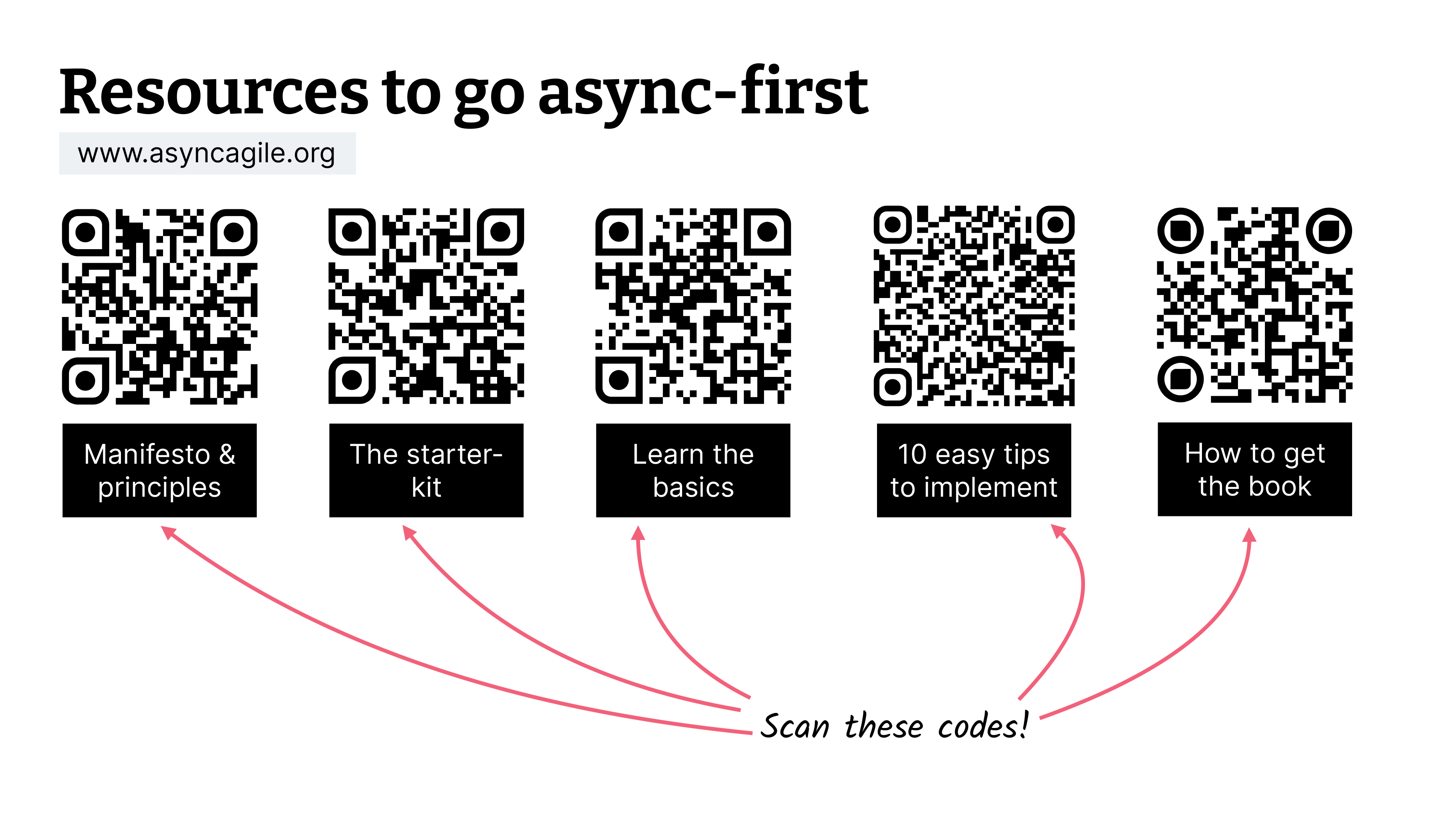
Figure 14: Use QR codes to share resources
with your audience.
If you’re concerned about copyright, you can provide a set of
watermarked slides through your QR codes. Your slides will be
useless without you, but those who want to reference them can have
them. The watermarked download will obviate the need for
floodmarks on your slides. Win!
A reusable colour palette, a suite of fonts and a blank slide —
that’s all you need to address the first decision space in your
presentations — that of your template. Once you have that template in
place, you can layer components on top of it.
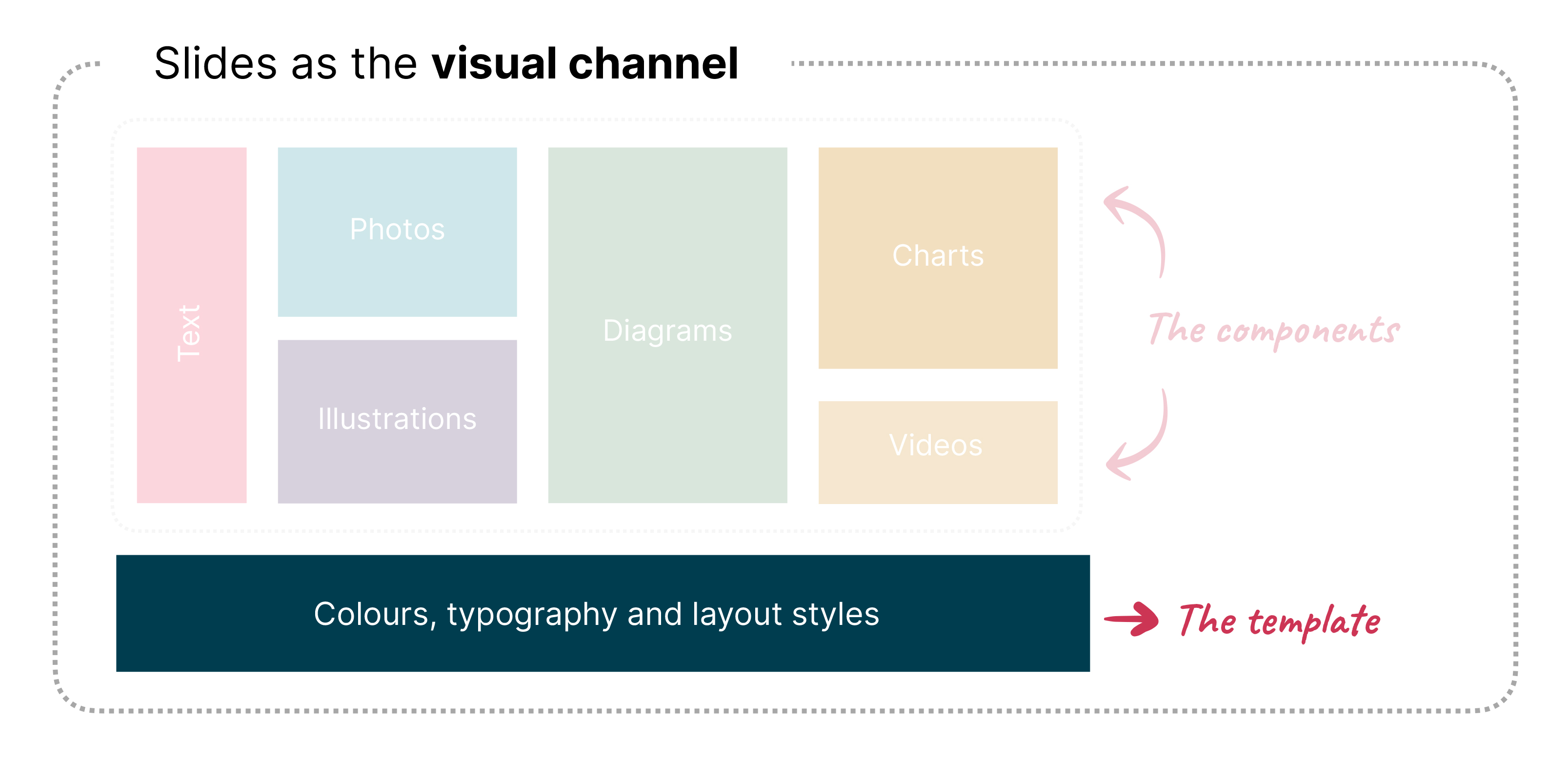
Figure 15: Templates — the first decision
space for slide design.
Since we’ve already discussed text and typography in this article,
we’ll jump to photographs and illustrations in the next post. I’ll
show you how to source images and how to give them a consistent look
for your presentation. You’ll also learn how to make text play well
with images and how you can avoid some of the most common antipatterns
when using images in your slides. See you there.