



In the early 1990s, two Russian artists, Vitaly Komar and Alexander Melamid, took the unusual step of hiring a market research firm. Their brief was simple. Understand what Americans desire most in a work of art.
Over 11 days, the researchers at Marttila & Kiley Inc. asked 1,001 US citizens a series of survey questions. What’s your favorite color? Do you prefer sharp angles or soft curves? Do you like smooth canvases or thick brushstrokes?
Komar and Melamid then set about painting a piece that reflected the results. The pair repeated this process in a number of countries, including China, France, and Kenya. Each piece in the series, titled “People’s Choice”, was intended to be a unique collaboration with the people of a different country and culture.
But it didn’t quite go to plan.
Despite soliciting the opinions of over 11,000 people, from 11 different countries, each of the paintings looked almost exactly the same.
After completing the work, Komar quipped:
“We have been traveling to different countries, engaging in dull negotiations with representatives of polling companies, raising money for further polls, receiving more or less the same results, and painting more or less the same blue landscapes. Looking for freedom, we found slavery.”
30 years after People’s Choice, it seems the landscapes that Komar and Melamid painted have become the landscapes in which we build brands.
This article is part of Branding Strategy Insider’s FREE newsletter. Join the world’s smartest marketers and subscribe here for actionable insights delivered directly to your inbox.
This Branding Strategy Insider article argues that the way brands look and the way brands talk have become dominated and defined by convention and cliché. Distinctiveness has died. From every angle that we look at, we find that everything looks the same.
Welcome to the age of average brands.
Let’s dive in.
Brand Identities Look The Same
In December 2018, Thierry Brunfaut and Tom Greenwood published an article in Fast Company where they coined a new word: Blanding.
“The worst branding trend (…) is the one you probably never noticed. I call it blanding. The main offenders are in tech, where a new army of clones wears a uniform of brand camouflage. The formula is sort of a brand paint-by-numbers. Start with a made-up-word name. Put it in a sans-serif typeface. Make it clean and readable, with just the right amount of white space. Use a direct tone of voice. Nope, no need for a logo. Maybe throw in some cheerful illustrations. Just don’t forget the vibrant colors. Bonus points for purple and turquoise. Blah blah blah.”
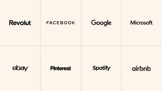
Companies like AirBnB, Spotify and eBay have all dropped colourful logos with expressive typography for a straighter, stricter, altogether more muted, alternative.
But it isn’t just technology brands.
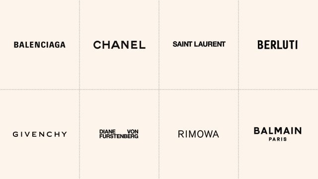
We can see the same blanding effect taking place in fashion. Yves Saint Laurent dropped its italicized, serif, tightly-kerned typography for an all-caps, sans-serif wordmark set in black. Balenciga, Berluti and Balmain did the same.
In a category defined by the art of elegantly standing out, all brands have started to blend in.
In a November 2021 article titled Distinction Rebellion, Contagious claimed that more and more brands seem content to drift along in a sea of sameness:
“Look up any new corporate brand identity unveiled over the past decade, and you will almost certainly find yourself staring at a flattened and simplified version of the company’s old logo. The aesthetic has become so ubiquitous that it’s acquired its own name – blanding.”
The visual identities of car brands seem to be following suit.
In September 2020, Vauxhall released a modernized, minimal marque. According to Henry Wong at Design Week:
“Vauxhall unveiled its new logo last week, a ‘confidently British’ look, which reworks the griffin icon and introduces a blue-and-red color scheme. Most prominent is its new flat styling — a simplified version of the logo’s previous 3D look. Vauxhall calls the redesign the ‘progressive face of the brand’.”
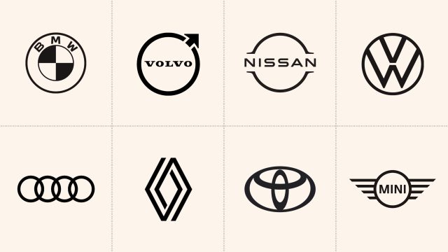
Vauxhall ditched a logo that looked like a chrome sculpted bonnet badge and replaced it with a flatter, thinner, altogether simpler execution. But they weren’t the only ones. As Wong says, at least five other major manufacturers had charted a similar course:
“It’s a familiar story within car branding of late. Audi first unveiled a minimalist-inspired rebrand in 2018, but it’s been followed by a host of other marques in the past year. Volkswagen, BMW, Toyota, and Nissan have all revealed new branding, each with a flat logo.”
So tech, fashion, and automotive have all converged on a single brand identity style. But we’re also seeing the same convergence in brand communications.
Advertising Looks The Same
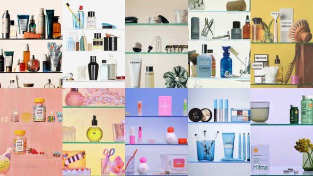
In 1982, the American fashion photographer Irving Penn shot an ad for Clinique that became known as “the shelfie”. The advert is simply a photograph of the inside of a medicine cabinet. A bright white background. Glass shelves. Bottles of pills. And a few well-branded Clinique products.
Since this iconic 80s ad, many other brands have created their own ‘shelfies’, including Selfridges, e. l. f. and Billie.
But this isn’t the only tried-and-tested trope.
Here’s AIGA Eye on Design:
“There are many more oft-mimicked setups like the shelfie currently bouncing around the zeitgeist; one omnipresent shot includes objects placed on a mirror reflecting the sky, giving the illusion of a product floating in midair. Another example uses a dense pattern of water droplets to refract a single item into a series of psychedelic miniatures, while yet another places subjects in front of faux scenic backdrops reminiscent of a low-budget Sears photo studio. Each of these distinct setups is utilized broadly and across industries, with the same composition and concept seen on the Instagram feeds of a major beverage syndicate and an indie skincare brand alike.”
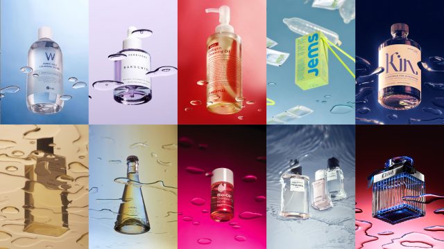
In an article for The Cut, titled The Tyranny of Terrazzo, Molly Fischer pushes this thought one step further.
While there are the shelfie, mirror, and water droplet tropes, these layouts all seem to share a surprisingly consistent style of art direction. They might be compositionally different, but they are conceptually alike:
“And then there are advertisements, making up a visual world of their own. The products on view (cookware, supplements, stretchy clothes) occupy blank pastel landscapes manipulated by a diversity of hands. These aren’t ads that bellow or hector; they whisper, in restrained sans-serif fonts, or chastely flirt, in letters with curves and bounce. They’re ads, sure, but they’re so well designed. In this era, you come to understand, design was the product. Whatever else you might be buying, you were buying design, and all the design looked the same.”
Whilst Clinique’s original Shelfie hails from the 80s, it wasn’t until the 2010s that it became a more widely adopted style. And the majority of companies who did so were digital-first, direct-to-consumer brands.
Elizabeth Goodspeed argues this is because these brands are more likely to draw inspiration from the same vast online sources. The result, she says, is a “moodboard effect”:
“This kind of visual homogeneity is a common occurrence in the art direction world, where ubiquitous styles operate less like trends and more like memes; remixed and diluted until they become a single visual mass. In today’s extremely online world, the vast availability of reference imagery has, perhaps counterintuitively, led to narrower thinking and shallower visual ideation. It’s a product of what I like to call the “moodboard effect”.”
Designers use the same online platforms, draw inspiration from the same sorts of imagery and, in turn, create broadly the same types of adverts.
So, brand identity and adverts are becoming more and more alike. But so too is the verbal language that brands employ.
Brands Sound The Same
Shai Idelson, Strategy Director at advertising agency BBH, collected a list of 27 brands whose taglines follow the “Find Your…” sentence structure. These include Lucozade’s “Find Your Flow”, Rightmove’s “Find Your Happy” and Volvic’s “Find Your Volcano”.
Idelson says:
“I love end-lines. The delicate art of capturing a meaningful thought about a brand or a product in as few words as possible. A great end line will touch my heart and stay in my memory forever. I still remember some from my childhood. But in the last few years, something happened to end lines. (…) The linguistic similarity is staggering.”
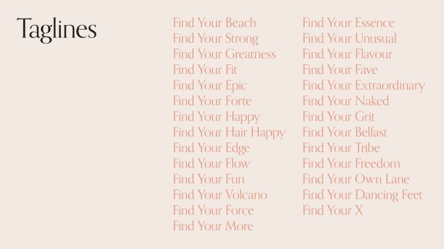
Behind all of these ‘Find your…’ taglines is the same tried and tested insight; that young consumers celebrate individuality above all else. That they don’t just want the products a brand offers, but their own unique version of it.
This insight (and I use that word very loosely) has also led to the “…Your Way” tagline construction. Nespresso has used ‘Indulge, Your Way’, Sonos opted for ‘Sound, Your Way ’, and Dunelm uses the tagline, ‘Dun, Your Way’.
And then there’s the ‘However you…’ cliché. Naked smoothies runs with ‘However you Healthy’, Captain Morgan has ‘However you Spice, Spice on ’, and Lemsip uses ‘However you Cold, Lemsip It.’
And it isn’t just taglines. In June 2021 Twitter began an investigation into how brands speak on the social media platform.
Here’s Contagious reporting on the study:
“When Twitter asked respondents to look at redacted tweets and guess which brand was responsible, only 38% could pick the right brand from a list of five options. And among those who did get it right, 17% admitted their answer was just a guess.”
Twitter then teamed with Pulsar Platform to analyze posts by 20 brands over a three-year period. And they didn’t tactically choose forgettable brands. The research included Yorkshire Tea, Netflix, KFC, PlayStation, and Patagonia. But whilst these brands come from wildly different categories and perform wildly different roles in people’s lives, the study found that, over time, they gradually reduced their average tweet length, adopted the same tone of voice, and even began using the same set of keywords. In short, the brand’s verbal identities all became shorter and more similar. No wonder users couldn’t tell one brand’s voice from another.
And then we have modern brand naming.
Here’s The Cut in an article claiming that brand names are in crisis:
“The buzziest new brand names are impossible to pronounce and even harder to remember. Take Syrn, the lingerie line from Sydney Sweeney, pronounced ‘siren.’ Or Skylrk, as in ‘sky lark,’ a streetwear label from Justin Bieber. One of the most popular new launches at Sephora is a line of lotions from influencer Claudia Sulewski called Cyklar, pronounced ‘sike-lure’. Even the names that are easier to sound out, like Alix Earle’s Reale Actives, are likely to cause headaches.”
The trend of brand names using spelling that is disconnected from how they’re pronounced has been gathering steam since 2024, when Serena Williams launched Wyn Beauty, and Beyoncé introduced her hair-care line Cécred (pronounced ‘sacred’).
But it isn’t so much that these brand names are hard to pronounce. The bigger issue is that Syrn, Skylrk, Cyklar, and Cécred are so linguistically similar that they morph into each other.
Everywhere we look, brands look the same. And now they sound the same as well.
Conclusion
So, there you have it. Brand identities, advertising, taglines, tones, and names are all becoming increasingly alike.
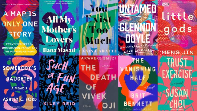
But it doesn’t end there. In the age of average, homogeneity can be found in almost every part of modern-day creative culture. Every AI app has the same starry app icon. The websites we visit and the illustrations that adorn them all look the same. Beyond branding, the interiors of our homes, coffee shops, and restaurants all look the same. The buildings where we live and work all look the same. The way we look and the way we dress all look the same. And our movies, books, and video games all look the same.
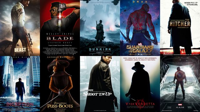
There are many reasons why this might have happened.
Perhaps when times are turbulent, people seek the safety of the familiar. Perhaps it’s our obsession with quantification and optimization. Or maybe it’s the inevitable result of inspiration becoming globalized.
Regardless of the reasons, it seems that just as Komar and Melamid produced the “people’s choice” in art, contemporary companies produce the people’s choice in almost every category of creativity.
But it’s not all bad news.
I believe that the age of average is the age of opportunity.
When every supermarket aisle looks like a sea of sameness, when every category abides by the same conventions, when every industry has converged on its own singular style, bold brands and courageous companies have the chance to chart a different course. To be different, distinctive, and disruptive.
Brand should strengthen competitive position, pricing power, and enterprise value. The Blake Project helps make that happen.
So, this is your call to arms. Whatever category your brand competes in, it’s time to cast aside conformity. It’s time to exorcise the expected. It’s time to decline the indistinguishable.
Make sure your positioning is deeply differentiated. Don’t rest until your visual and verbal identity is doubly distinctive. Build a big idea and communicate it in a way that is unmissable and unmistakable. The result will be that your brand is first to mind and first to find.
For years, the world of branding has been moving in the same stylistic direction. And it’s time we reintroduced some originality.
Or as the ad agency BBH says.
When the world zigs. Zag.
Contributed to Branding Strategy Insider by Alex Murrell, Strategy Director, Epoch
At The Blake Project, we help leaders turn brand into a disciplined driver of financial performance — strengthening pricing power, competitive position, and enterprise value. Email us to start a conversation about enduring profitable growth. For The EBITDA.
Branding Strategy Insider is a service of The Blake Project, a strategic brand consultancy focused on turning brand into pricing power, growth, and enterprise value.