


By now, we’ve established the need
for a strong narrative before you build slides. Not every
presentation needs slides. Once
you’ve built your narrative, you may decide that a speech is good
enough. In fact, a few months back, I did just that. I was a
leader-in-residence at our graduate program, Thoughtworks University.
The trainers expected me to deliver a keynote, and I decided against
slides. I called the talk “1% better — three things I wish I’d known as
a grad.” 15
minutes, no visuals, just talk. And that was fine! The world didn’t
end because a corporate talk didn’t have slides.
” title=”1% better — a keynote delivered without slides”>
You may work at a corporation where no conversation can begin without
a slide deck on the screen. I’ve found this reliance on slides
unproductive, especially when the cognitive load of frameworks sabotages
the high-bandwidth collaboration possible when smart people find
themselves in a synchronous space.
All this said, I’m also an unabashed advocate for effective slides.
Many presenters underestimate their content, thinking their topic is
dull and that nothing will make it interesting. That may be true for a
minority of topics. In which case, why
are you even presenting? In most cases, you believe that your topic
is interesting enough that you want to change something for your
audience. You may want to sell a product, advocate for a new way of
working, teach them something new, or motivate and inspire them. This is
where your narrative can benefit from impactful visuals.
While design and decoration aren’t the same thing, you also want
your visuals to look good.
Attractive things make people feel good, which in turn makes them
think more creatively…positive emotions are critical to learning,
curiosity, and creative thought.
With that context behind us, let’s unpack when slides are most
useful for presentations and the fundamental principles for building
them.
Use slides as a complementary visual channel
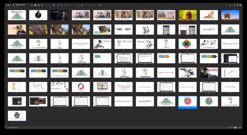
If you examine the light table (a.k.a. slide sorter) view of my
slide decks, they won’t make sense to you. Without my narrative,
they’re useless. And yet, the slides employ the same components that
an
infodeck might.
- Colours, typography, and slide layouts that determine the overall
template; - and multiple components that include but aren’t limited to:
- text;
- images and illustrations;
- diagrams;
- charts;
- and videos.
Figure 1: Slides from a past talk.
The most important distinction between a presentation and an
infodeck is what Neal Ford
calls “control over the rate of knowledge exposition.” Unlike static
infodecks, the builds (animations) and transitions in your
presentation slides allow you to control that rate of knowledge
exposition. You get to manage your audience’s cognitive load.
Slides also provide what Martin Fowler calls a “complementary
visual
channel” for your presentation. As a speaker, you’re conveying a
message to your audience. The most important part of that message
comes from your voice, expertise and stage presence. The slides
shouldn’t make you redundant. Instead, they should enrich the message
you’re already sharing using the audio channel.

Figure 2: You provide the words.
The slides provide the visuals and some reinforcing words.
The idea of a complementary visual channel becomes even more
important when you reflect on how we learn. In their 2016 book,
E-Learning and the Science of
Instruction, Clark and Mayer establish the “multimedia
principle”; i.e. people learn better from words and graphics than
from words alone. We encode words and visuals in different parts of
our brains. When you provide the words and your slides provide the
visuals, your audience benefits from dual encoding. Your message
becomes more memorable than if you provided words alone, or worse,
words similar to those on your slide.
Slides aren’t the only visual channel possible. Tools like Prezi,
Mural and Miro let you create a giant canvas for your talk, and you
can pan and zoom into specific parts of it to support your
presentation. However, since slideware is more ubiquitous in
corporations, we’ll focus on the 16×9 slide format for the rest of our
discussion.
Couple slides tightly with the speaker
When we think of slides as the visual channel for our
presentations, another principle becomes apparent — your visuals must
tightly couple with what you’ll say, without repeating what you’ll
say. After all, you’ll present to a literate audience, and they can
read faster than you read aloud.
Take a look at the slide below. It’s an example of the
standard-issue slides you’ll see in a corporate infodeck. As a
standalone reading artefact, it’s passable. As a presentation slide,
it’s a disaster. By the time you start with the first point, your
audience will have already speed-read the entire page. Martin Fowler
calls this phenomenon “stealing the narrative,” because slides like
these make you lose control of your story.
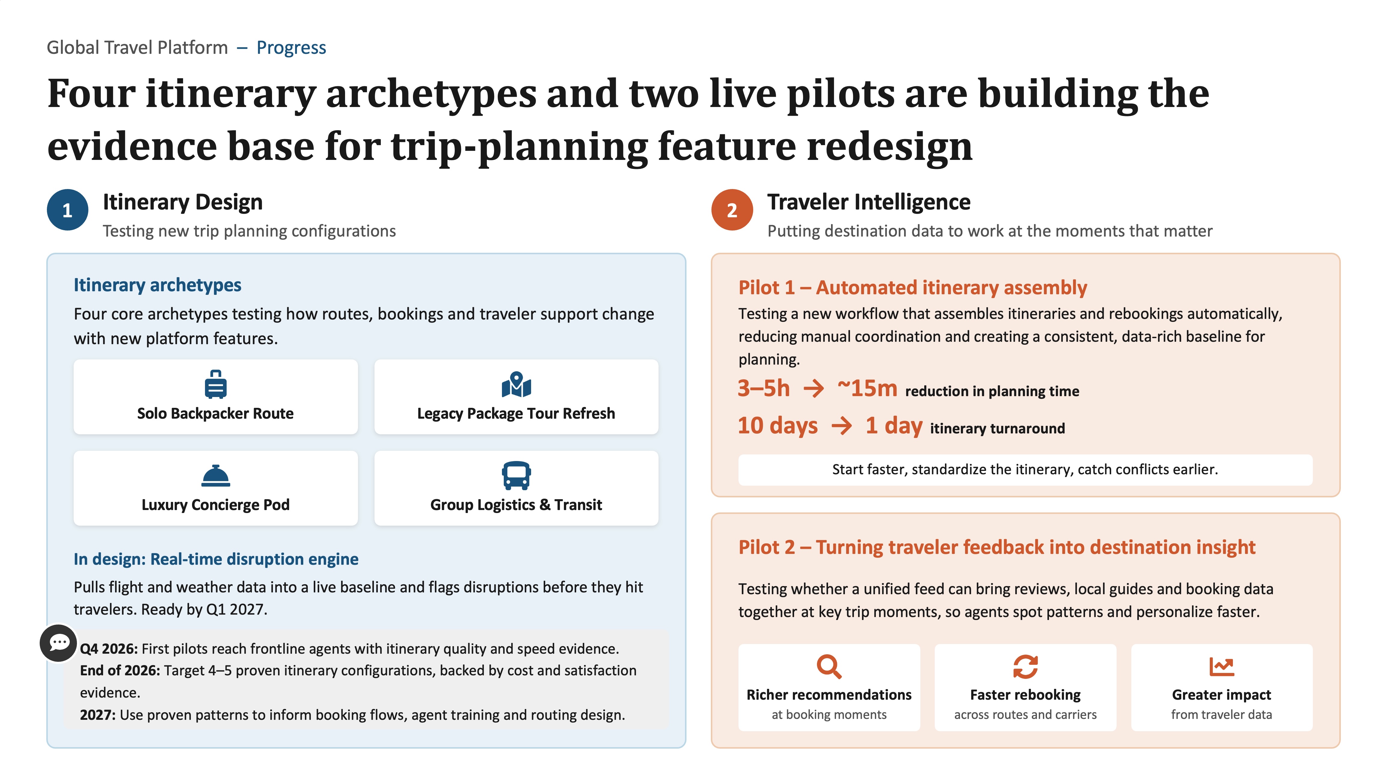
Figure 3: Audiences can read such slides
faster than you.
The above slide is an example of why you can’t present an infodeck,
no matter how elegant the design. Don’t beat yourself up when your
eyes glaze over at the sight of such slides. The above example also
begs the question of why you’re there in the first place.
If the slides can stand by themselves, why are you up there in
front of them? Just hand out the slides and sit down!
What’s the alternative, then? If I were presenting the content on
the slide above, I’d break up the visuals to match my narrative. The
single slide above would split into the 31 visuals below, driven by
slide transitions and animations. The words on screen will appear as
a summary of what I say, either in sync with my speech or right after
I’ve made my point.
” title=”A single slide split into 31 visuals, driven by transitions and animations”>
Now, if you were the narrator, you might choose a different split.
There lies the disadvantage of well-designed slides that serve as a
complementary visual channel. It’s difficult to share your slides
with someone so they can present your topic. Effective slides often
reinforce a speaker’s storytelling style, pace, and anecdotes. They’re
fine-tuned to the speaker’s idiosyncrasies. While you can use another
speaker’s slides, you’ll have to tune them to your delivery
approach.
Practice minimalism by default
When you design slides that are in sync with your speech, you can’t
design heavy, wordy slides. A single slide can have many elements, but
you must control the rate at which you reveal those elements, so you
don’t let your audience race ahead of you. So, I suggest being
minimalist by default when constructing your slides. Take Antoine de
Saint-Exupéry’s quote to heart.
Perfection is achieved, not when there is nothing more to add,
but when there is nothing left to take away.— Antoine de Saint-Exupéry
When designing slides for your presentation, think in snapshots and
be ruthless about how little each snapshot reveals and how much it
adds to a previous snapshot. Invariably, you’ll end up with a deck
with many slides, and as I’ve said earlier in the series, the number
of slides doesn’t matter.
The example below will help make my point. These are slides I
presented to a C-suite audience to explain developer relations. It
took me two minutes to get through 14 snapshots, all related to the
same base diagram. When you thumb through the slides, you’ll see that
I reveal each part of the framework in a new snapshot. I then overlay
the diagram with an example of that aspect of developer relations,
then move back to the main diagram and reveal the next aspect.
” title=”Fourteen snapshots that build up a single developer relations diagram”>
Designing the slides this way enabled me to manage my audience’s
cognitive load and the rate at which I presented information.
To practice minimalism, think of slides as billboards. In her book,
slide:ology, Nancy Duarte says
that slides are “glance media” and share much in common with
billboards. You want each visual or snapshot to be easy to grok in a
few seconds. If a billboard takes too long to understand, it could
cause an accident on the street. If a slide takes too long to
process, well, you might have a cognitive accident to deal with.

Figure 4: Slides have a lot in common with
billboards.
Treat slides as integrated visuals
If your audience is thinking about your slides, they’re not paying
attention to your message. This is why I never let anyone else
control my slides. “Next slide, please” is the easiest way to
distract your audience from the message and have them think about
your slides.
The most effective slides often don’t feel like a collection of
components. They feel like integrated visuals that, along with the
speaker, create a cinematic presentation experience. The audience
doesn’t sense how one slide transitions to another or how you’re
using layers and builds in your visuals, and they shouldn’t have to.
Here’s a three-minute video presentation that may help make my
point.
” title=”A cinematic presentation with integrated visuals”>
The above presentation is simple. It uses only a few icons, text
and images. But it’s difficult to say where one slide begins and
another ends. And that’s by design. The more continuity we create
across our slides, the less salient the number of slides and their
construction. The less salient these inner workings are, the more
salient our narrative can be.
Use the visual channel to say a thousand words
A year or so back, I delivered a short talk about AI and a
“perpetual beta” mindset. I won’t get into the details of the talk,
but I’ll talk you through the slides you see below. In my
presentation, I explained how AI models on cameras use a split-second
heuristic to autofocus on a subject’s eyes — human or animal. I then
cycled through many subjects the camera eye-detects with ease and
said, “What happens when an animal has eyes all over their body?” On
cue, a leopard’s photo appeared on screen. The audience could see why
the camera fails to autofocus. That punchline, combined with the
blurry photo of a leopard, got me a good laugh from the audience and
helped me make the point that even mature AI is fallible.
” title=”Thirteen photographs that carry a minute of narration about AI and eye detection”>
When you deliver a presentation, you often assume the role of an
educator. Visuals can help you add a layer of entertainment to
your education. Notice how little text I use in the above example. I
let the photographs do most of the talking. At the end of the segment,
one of the photos also adds comic relief. 13 slides, a minute of
talking, and 13 photos that say more than I ever could without the
slides.
This isn’t to say that text is unnecessary. Text can reinforce or
summarise what you say and help you label parts of the visual. Saying
a picture speaks a thousand words doesn’t mean pictures don’t need
explanation or that using words on screen signals failure. As
Dan Roam explains,
A good picture substitutes for the thousand words that are the
least necessary.— Dan Roam
The trap to avoid is letting the text substitute for you, the
presenter. Remember, the slides are
a complementary
visual channel.
Never send the slides
All this brings us to the series title. I meant for it to be
provocative, but I also mean for it to be a principle. If your
slides serve as a visual channel that reinforces what you say,
they can’t stand alone. If you send them out in advance, you’ll
only undermine your storytelling and the humour, intrigue and
impact you’d have planned for your presentation. So, I don’t
recommend sending your slides in advance. That said, I want to
offer alternatives.
If you want to prepare your audience, send them prep
notes. Corporations are busy places, and people struggle to
prepare in advance, so the more succinct your prep materials, the
more likely people will consume them. One page, a short email, or
even a structured instant message can be preparation enough.
If you want to align with your co-presenters, colleagues, or
boss before the presentation, then do a dress rehearsal. If
a presentation is high-stakes and you don’t have time for a live
rehearsal, you could record yourself giving the presentation and
send the video out to get feedback. Such feedback can help you
solidify your prep and get feedback to tighten your narrative and
delivery. By getting your colleagues and boss onside before an
important presentation, you’ll be able to seed your audience with
supporters — a pattern Ford, McCollough and Schutta call the
“Greek chorus”.
If you want your audience to have some resources handy when you
present, create reference materials. You can hand these out
as prints before you begin your presentation, or create an online
resource. When I deliver presentations online, I often share
resources in the chat during the presentation to manage my
audience’s cognitive load. The minimalism principle applies here
too. Reference materials are a distraction. The more focused they
are, the more effective they’ll be.
And finally, if you want to give your audience something to
take away, create a handout that summarises your talk. If
you’re diligent about writing presenter notes, a PDF of your
slides, juxtaposed with your presenter notes, can serve as a
handout for your talk. If I’m speaking at a conference, I often
create a single-page takeaway for my audience. When Martin was
active on the conference circuit, he shared
talk notes
for his presentations.
Not every talk needs so many artefacts. It’s your call, based on
what you know of your audience. For example, when I presented
research findings on the state of remote work at Thoughtworks, I
didn’t send any prep notes, but I did create a handout and a
dashboard where my audience could play with the raw data. Since
the dashboard would be a distraction during the talk, I shared it
towards the tail end to let the data provoke questions from the
audience.
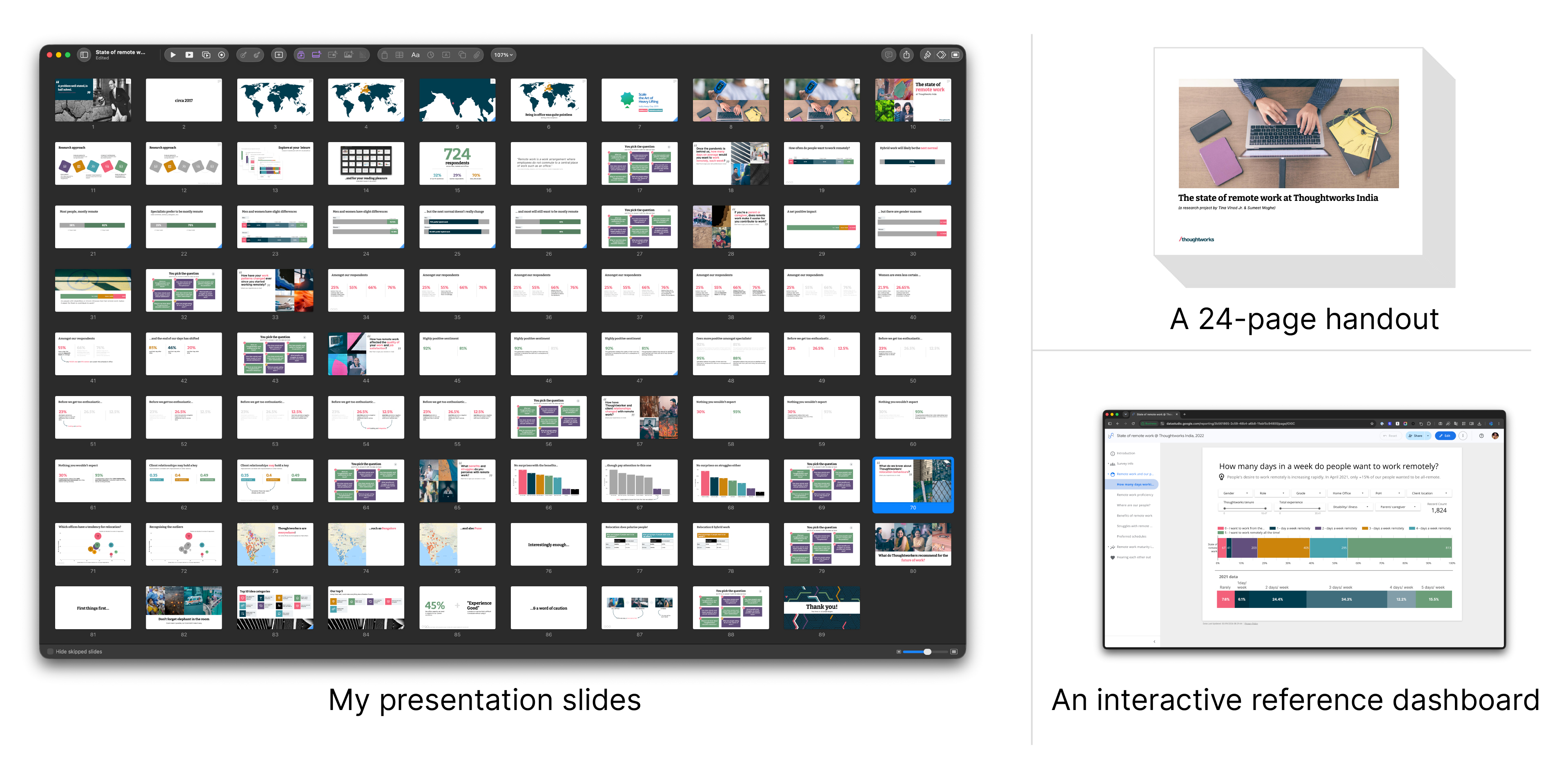
Figure 5: One presentation.
Three artefacts.
Is the approach I’m suggesting a lot of work? Perhaps. If your
story is worth telling, you care about your audience’s experience
engaging with you and the impact you make, then it’s a worthwhile
effort.
Now, do I never send my slides? Never say never, right? There
are exceptions. Sometimes my colleagues want to adapt my slides to
their narrative. Other times, people are curious about how I built
my slides. In such situations, I do share my slides. No problem.
Use your judgment to make exceptions when necessary.
Rewrite the rulebook
You’ll notice that I’m asking you to throw away the rulebook that
says you should have one slide for every two minutes of speech, or the
one that says you need six bullets per slide with no more than six
words per bullet. Those are the death-by-PowerPoint rules. Our
principles are different.
- As presenters, we seek to control the rate of knowledge
exposition. - Slides serve as a visual channel to complement the speaker.
- Slides and speakers are tightly coupled.
- The number of slides doesn’t matter.
- Be minimalist by default.
- Treat slides as integrated visuals, not a collection of
components. - Never send the slides.
And finally, as I explained with the photographs in the “perpetual
beta” presentation, we want the visual channels to say a thousand
words and blend education and entertainment.
Now that I’ve laid down some principles, let’s change track to “how
to” build effective slides. In the next post, we’ll begin with the
fundamentals of colours, typography and layouts.